Are We Taking Digital Accessibility Seriously?
Digital accessibility has come to the forefront of my work life during the development of a website dedicated to one of our projects. I have been fortunate to have access to a Digital Accessibility Services team and a wonderful development team. Without these teams, I’d be lost.
In light of this new focus in my work life, I wanted to explore how major websites are faring with digital accessibility.
Background
Each year since 2019, WebAIM has conducted WebAIM Million, an annual accessibility analysis of the top 1,000,000 pages. That analysis provides a great look at web accessibility on a large scale over the past few years. In 2021, the analysis of 1,000,000 websites found that 97.4% had WCAG 2 failures. Here in this blog post, I am narrowing in on the top 50 website to see how industry leaders are doing.
Are major websites addressing digital accessibility in meaningful ways? Is it a priority for those developing these websites? What can we do in our own work to ensure technology is accessible to all?
Data Collection
Data was collected from the homepages of the top 50 visited websites in the United States.1 2 If the homepage was a log-in page, this was used without logging into the site.
Using the WebAIM WAVE Web Accessibility Tool extension, I tracked the number of errors and the number of contrast errors for each website’s homepage. Some examples of errors include missing alternative text, missing form labels, empty links, and broken ARIA references. Contrast errors indicate instances of low contrast between text and background colors, which makes it difficult to read for users with low vision.3 While this approach of only tabulating the number of errors does not factor the number of elements on the page, it will gives us a rough look at how these leaders are doing.
I additionally tracked whether or not there is an accessibility statement or a link to an accessibility statement on the homepage. The lack of a link does not mean the site has not invested in digital accessibility, nor does it mean that accessibility is not addressed elsewhere on the site, but perhaps it gives us indication of the prioritization of accessibility.
Analysis
First, we’ll import and check a sample of the data. The data and R code is available on Github, if you wish to run your own analysis.
library(tidyverse)
top_50_websites <- read.csv("https://raw.githubusercontent.com/bnlsn/blog-data/main/digital-accessibility/Accessibility-Top-50.csv")
head(top_50_websites, 3) %>%
  knitr::kable()
| Ranking | Website | Category | Subcategory | URL | Errors | Contrast.Errors | Accessibility.Statement |
|---|---|---|---|---|---|---|---|
| 1 | Computers Electronics and Technology | Search Engines | google.com | 1 | 7 | No Statement | |
| 2 | Youtube | Arts and Entertainment | TV Movies and Streaming | youtube.com | 25 | 1 | No Statement |
| 3 | Computers Electronics and Technology | Social Networks and Online Communities | facebook.com | 2 | 45 | No Statement |
I’ll note here that I first simply used head(top_50_websites), but found that the output text did not have a high enough contrast to pass WCAG guidelines. Instead, I piped the results to knitr::kable. This has the added benefit of looking cleaner.
The data includes the site ranking, the category and subcategory, URL, number of errors, number of contrast errors, and whether or not an accessibility statement is provided. From here we’ll begin to look at how many errors have occurred on these homepages.
Error Frequency
How often are these errors occurring in the top 50 websites?
ggplot(data = top_50_websites, aes(x = Errors)) +
  geom_histogram()
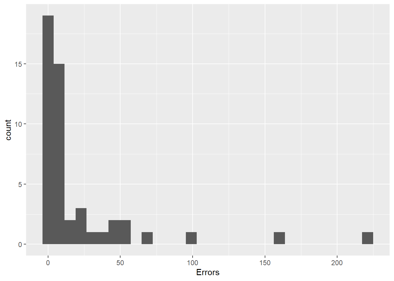
Figure 1: Histogram of accessibility errors
ggplot(data = top_50_websites, aes(x = Contrast.Errors)) +
  geom_histogram()
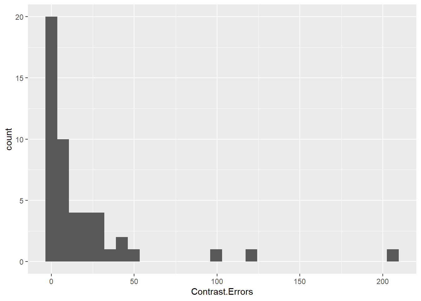
Figure 2: Histogram of contrast errors
Most websites have zero or a few errors, though there is a long right tail. Some sites had over 100 errors or 100 contrast errors! We will need to dig further to find which types of sites these errors are occurring and whether or not they are directly addressing accessibility with clear statements.
Categories
Next, we will look at how this varies by industry. With a total sample size of 50, and some of these categories with only 1 or 2 websites, we won’t place too much emphasis on this summary, but it may give some insight into the larger picture.
top_50_websites %>%
  group_by(Category) %>%
  summarise_at(c("Errors", "Contrast.Errors"), mean) %>%
  arrange(-Errors) %>%
  knitr::kable(digits = 1)
| Category | Errors | Contrast.Errors |
|---|---|---|
| Sports | 221.0 | 123.0 |
| Adult | 83.2 | 53.5 |
| Home and Garden | 55.0 | 23.0 |
| News and Media | 30.8 | 15.6 |
| Arts and Entertainment | 14.2 | 16.6 |
| Science and Education | 10.3 | 20.7 |
| E commerce and Shopping | 9.8 | 4.2 |
| Reference Materials | 8.0 | 0.0 |
| Computers Electronics and Technology | 6.6 | 18.1 |
| Games | 4.5 | 0.0 |
| Business and Consumer Services | 4.0 | 6.5 |
| Jobs and Career | 1.0 | 0.0 |
| Finance | 0.0 | 1.0 |
The categories with the most errors are Sports and Adult, while the categories with the fewest errors are Finance, Jobs and Career, and Business and Consumer Services. Generally, we see here that business-focused websites are ahead of leisure-based websites. Perhaps when jobs and money is on the line, there is greater incentive to be more accessible.
Accessibility Statements
The presence of an accessibility statement may indicate whether or not digital accessibility is being prioritized. Is there a difference in the number of errors between websites with and websites without a digital accessibility statement?
top_50_websites %>%
  group_by(Accessibility.Statement) %>%
  summarise_at(c("Errors", "Contrast.Errors"), mean) %>%
  knitr::kable(digits = 1)
| Accessibility.Statement | Errors | Contrast.Errors |
|---|---|---|
| No Statement | 29.6 | 25.5 |
| Statement | 8.1 | 7.6 |
The websites with an accessibility statement had an average of 8.1 errors and 7.6 contrast errors, while those without an accessibility statement had an average of 29.6 errors and 25.5 contrasts errors - over three times as many of each!
This is a stark difference, and was even apparent during the data collection phase. Once a large number of errors was detected, I began expecting to not find a statement. It is clear that whether or not a site has a accessibility statement is a solid indicator of the number of errors that are present.
Let’s look at the relationship between errors and contrast errors, and additionally visualize whether or not the website includes an accessibility statement.
ggplot(data = top_50_websites, aes(x = Errors, y = Contrast.Errors, color = Accessibility.Statement, shape = Accessibility.Statement)) +
  geom_point() +
  scale_fill_manual(values=c("#E66100", "#5D3A9B"))
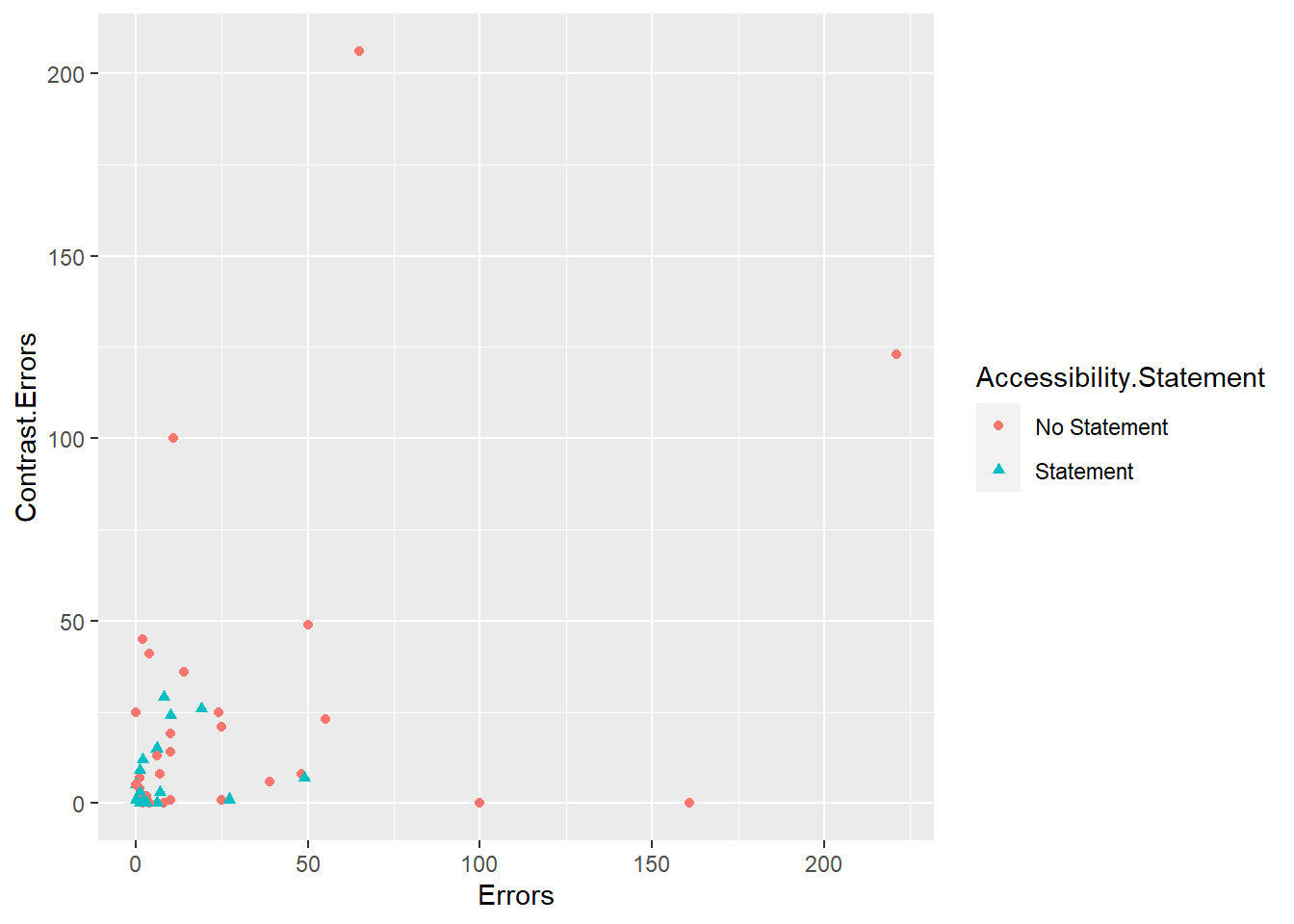
Figure 3: Scatterplot of accessibility errors and contrast errors
There seems to be some correlation between the number of errors and contrasts errors, but not as strong as I had expected. And those data points above that had 100+ errors or contrasts errors? No accessibility statements. If we do not prioritize this work, it will not be done.
Summary
Are we taking digital accessibility seriously? We can do better.
So what do we do about it?
- Use accessibility extensions to assess your own site. There are many out there. For this, I have chosen to use WebAIM to detect errors. Other extensions will allow you to view your site while simulating colorblindness or vision loss.
- Make digital accessibility a priority. This means accessibility should be part of your workplan. Accessibility should have time and resources allocated from the beginning of the project.
- Include an accessibility statement. Learn more at the W3C Web Accessibility Initiative, and even use the Generator Tool.
For R bloggers, there are a few things we can do with our outputs to achieve better accessibility. Here are some of the updates I made to this post after checking for accessibility errors:
- Graphical results need captions. Here I used
fig.cap = “…"in my code chunks to add captions. - Be conscious of the text contrast of code output. For example, instead of printing
head(), I piped the results toknitr::kable. - Use colorblind-friendly color palettes in our graphical results.
- Better yet, when using color, use a second method to show distinctions, such as shapes. When I added
color = “…"to theaes()function, I addedshape = “…"immediately after with the same variable to ensure there were multiple representations when color was present.
After checking and updating, there are still some contrasts errors with the syntax highlighting of the code blocks. A solution was not immediately apparent to me, but toggling the site to dark mode provides a sufficient amount of contrast to meet guidelines.
Digital accessibility is never done. It is not an item to be checked off your list and forgotten. We need to make it a part of our process. Let’s make technology accessible to all.
If you encounter any accessibility barriers on this site, please reach out and let me know.
-
Similarweb, as of November 1, 2021. https://www.similarweb.com/top-websites/united-states/ ↩︎
-
Data was collected on January 1, 2022. ↩︎
-
For full WCAG 2.1 Guidelines, visit https://www.w3.org/TR/WCAG21/ ↩︎